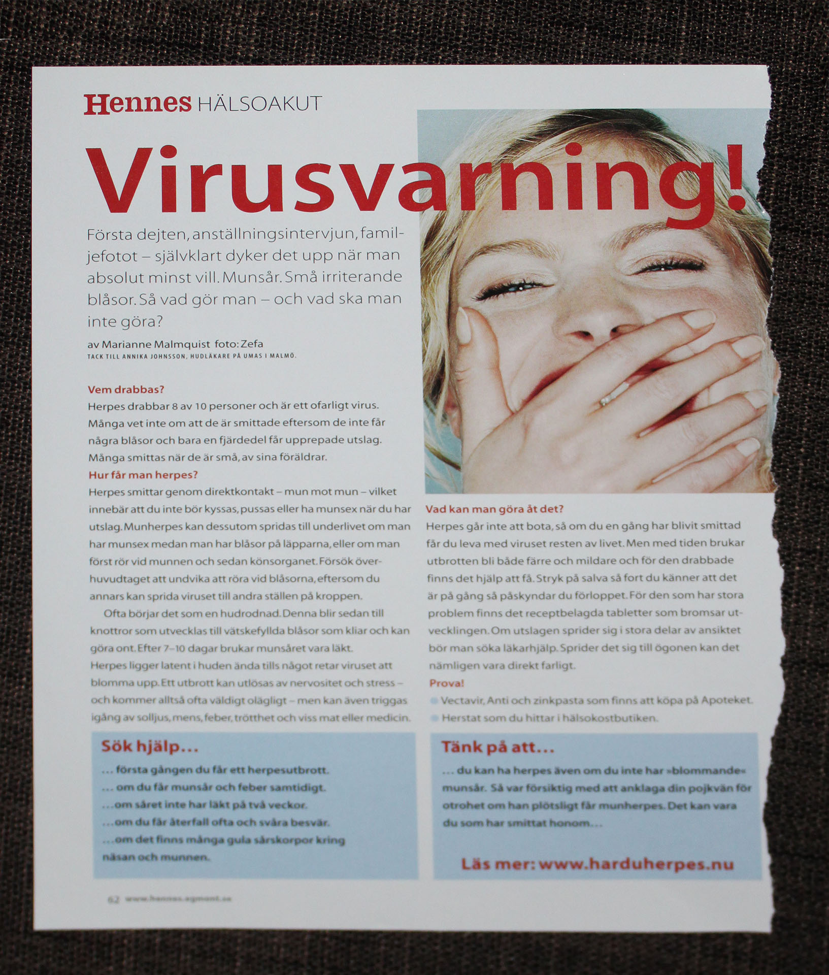
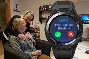
Smartwatches within healthcare

Read more below.
Continuation...
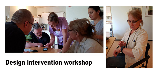
My research focused on three areas: Tunstall and an existing mobile phone app; smartwatches – hardware and
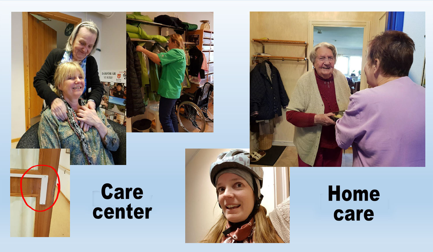
platform-specific design conditions; and the Swedish elderly care, with 9 visits to the elderly home care
in Klippan and a care center in Burlöv.
Methods:
• A-day-in-the-life-observations with questioning and photographs
• Contextual interviews with notetaking and photographs
• Workshops with my designs intervening in the users present practice
• Sketching for communicating design ideas and ideating
• Dialogism where presentations to stakeholders help drive the design
Key learnings:
• IXD is a cheap and effective way of exploring new technology
• Show a company how IXD can streamline their design process, based on field work observations
• How involving users provide invaluable research material, like caregivers not being allowed to wear anything beneath their elbows
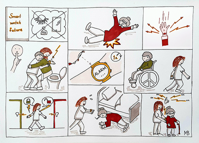
• Importance of images for communication and ideation (see the future scenario above)
• Curiosity about co-designing and positive experience of working with real users on a real case
Design propositions:
• 4 design opportunities, identified based on field work
• Iterations of concept sketches
• 2 look-and-feel-prototypes in a smartwatch (made in Java/Android Studio)
Tunstall is now ready to start developing for smartwatches, one step ahead of their competition.
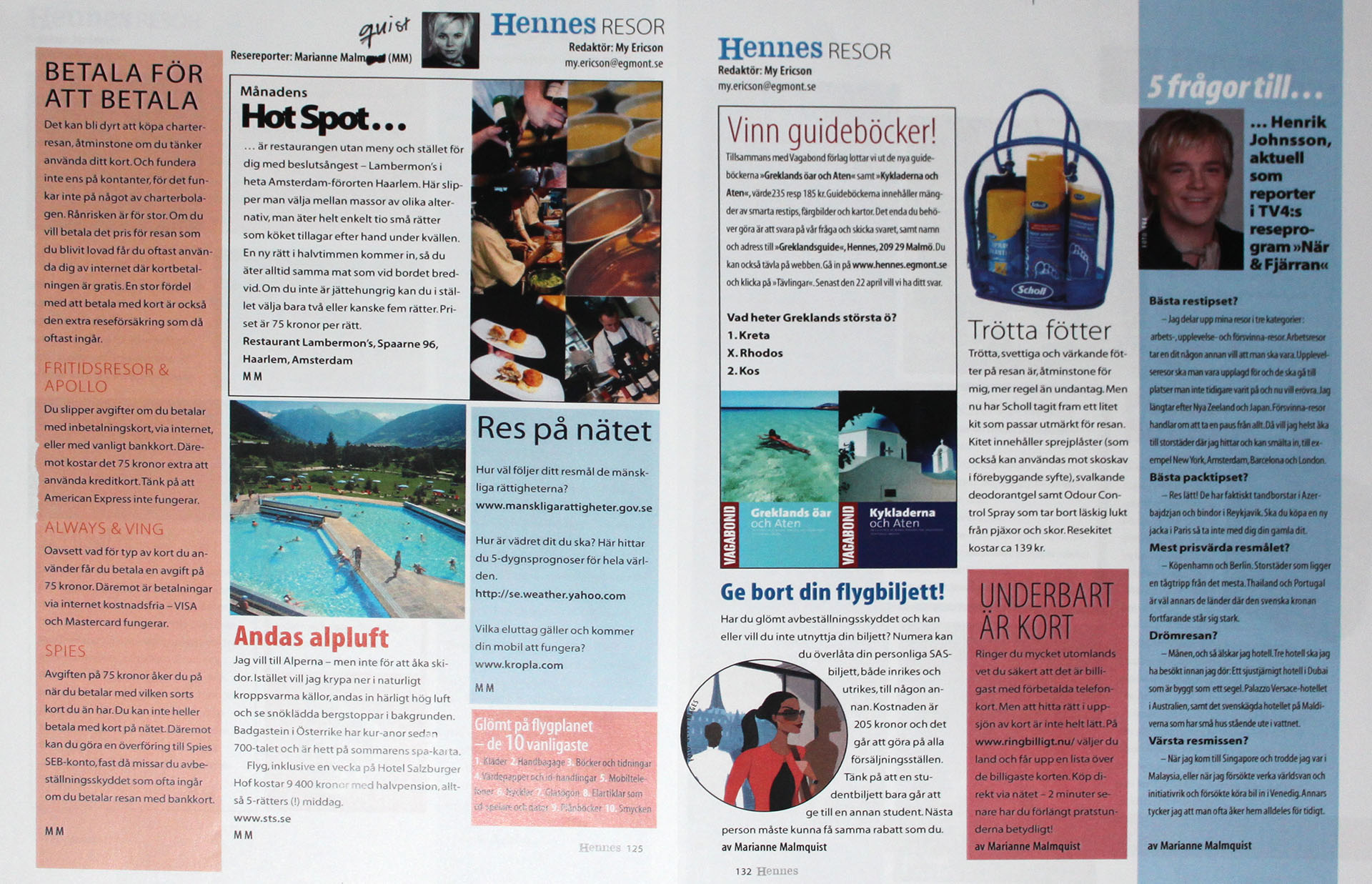
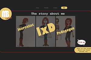
MB comics - a different presentation

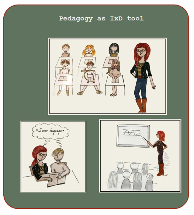
This is a digital comics project that tells the story about the professional me. The target group is future employers. I want to show you how I as an interaction designer benefit from my experiences as a journalist and a pedagogue and leader.
The way I do it here, as a digital comic, I play via coding, with sounds, interaction, drawing and classic story telling. The aim is not to present a complete picture of me, but to show some things about myself in a playful way.
I chose to do this project because I wanted to do something that stands out.
Click to experience the comic!
Service design/co-design

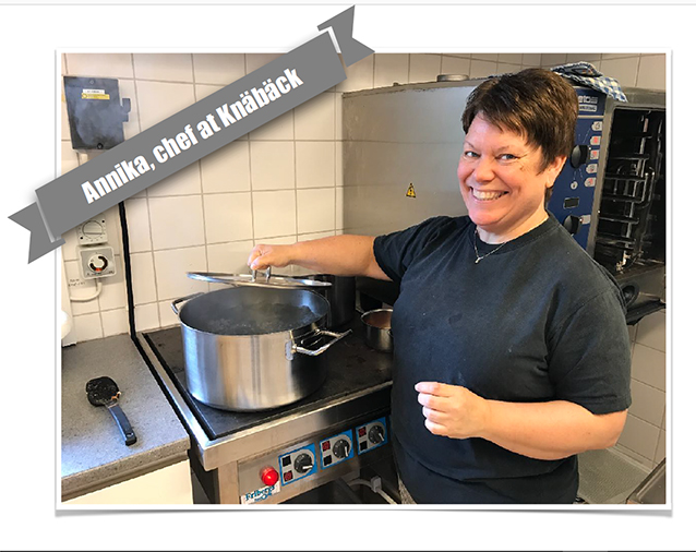
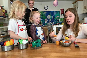
Desktop research grounded the entire process. And before the a-day-in-the-life I conducted an initial meeting with the chef and headmaster.
A flowchart illustrated the communicational, inspirational and influential flows between stakeholders. Two breakpoints were found: between the kitchen and Malmö City; and within the preschool. Those were grounds for further research.
The inspired chef, with almost no food-waste, was a major finding.
A reverse-roles-workshop with interviews/drawing-session and observations was conducted by me to learn about strategies used by teachers, children and the chef. To synthesize all the material and find patterns, and identify key issues and key findings, ideation with the design team was conducted, where ideas were sketched. 3 design spaces were formulated: “the good example”, “chef’s collaboration”, and “children’s check-in”.
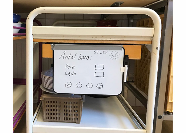
A service blueprint, user journeys, and a digital prototype was made for the chef’s collaboration platform. For the children’s check-in, a key finding, the food trolley, was used. A physical prototype in form of a whiteboard fastened on one of the preschool’s trolleys was tested and well-received. The preschool later bought whiteboards for all their trolleys rolling back and forth to the divisions, to enhance communication within the preschool.
For the good example, the chef’s good and inspirational work was highlighted, which resulted in the chef afterwards being engaged in holding inspirational presentations within Malmö City.
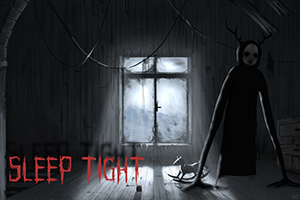
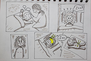
VR game "Sleep tight"

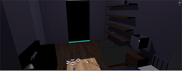
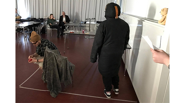
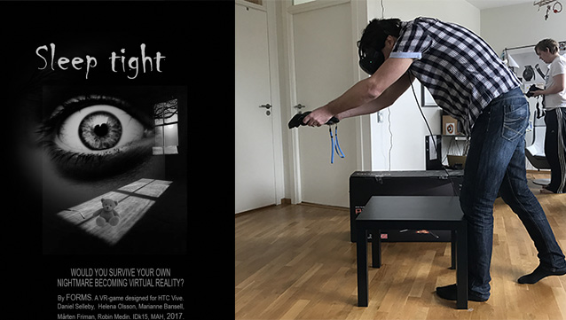
This was a school project for a course in Games and Play. My contributions and responsibilities were:
The concept idea.
Writing the story.
Voiced a character.
Created a LoFi prototype by rollplaying the VR game, to test the concept and story.
Conducted playtesting to try out the use of real physical objects within a VR-game.
Designed the promotion poster.
In the end we had a fully functioning locked-room horror VR-game, which was highly appreciated when we did a full day of public test-runs at Malmö University.
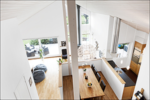
House design: "Villa Bansell"

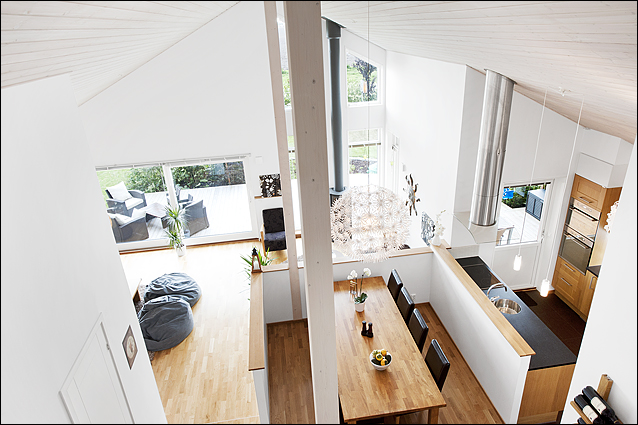
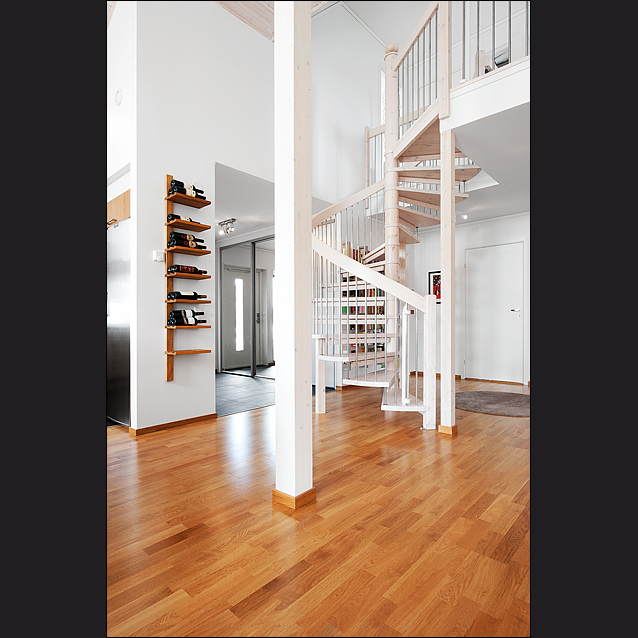
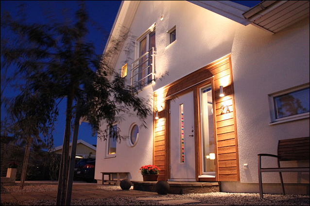
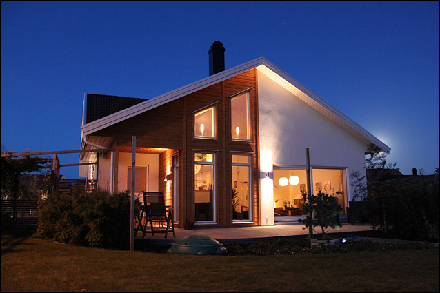
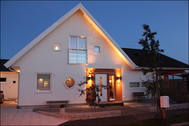
This house I designed. I made the drawings which later were realised into
a villa in Stävie in 2009.
There is 5,5 meters height to the ceiling. A luxury bathroom, a chef's kitchen,
a garden with different rooms and a thought-through display of all rooms
and doors, lights, and kitchen plans to suit everyday life.
Java programming skills

Highest possible grade in the course.
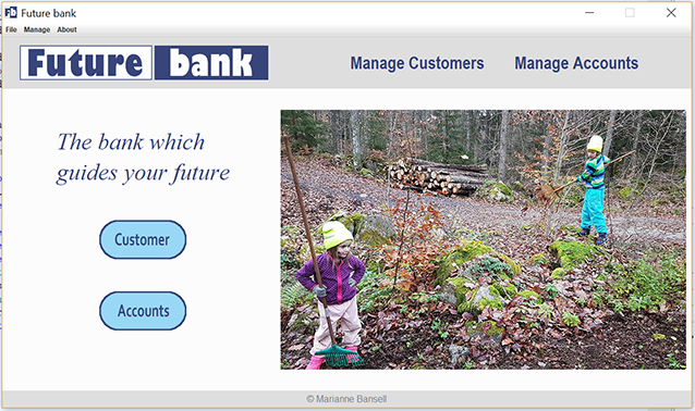
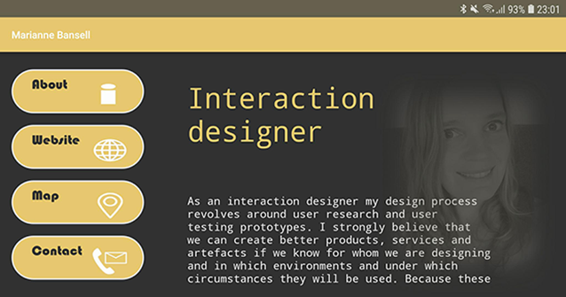
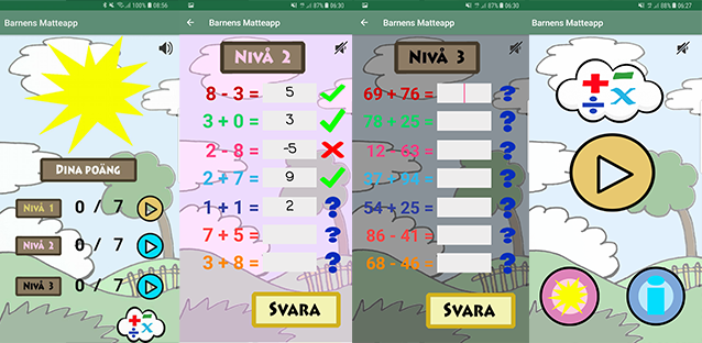
Apps made in AndroidStudio/Java. Find them in GooglePlay by searching “Bansell”.
A presentation app made for tablets.
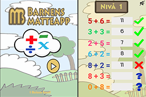
A children’s math app for mobile phones.
A publishing tool for Malmö University’s promotion TVs. The stakeholders were the MAU communication department and the receptionists who publish material on the TVs. The program which was based on MAU’s graphical profile, was publically released to get a uniform design on published material.
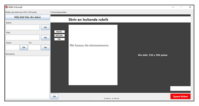
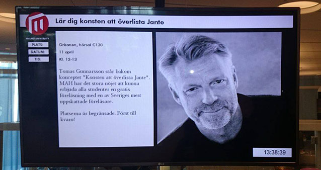
For the publishing tool the mission was solely to “do something about the ugly TVs”. By conducting research on the conditions regarding the University’s hallway promotion TVs, I found the stakeholders. They were: people creating material for the TVs; the publishing receptionists; and the MAU communication department.
Then I sketched ideas to bind all the stakeholders’ inner goals together, and came up with the concept idea of a publishing tool. The publishing tool reshapes all material into uniform design, adjusted to the MAU graphical profile. Then I coded the tool in Java/Eclipse.
The program was taken into use, and appreciated by both the communication department, the receptionists and people creating material for the TVs.
Sketching as a tool: storyboard-scenarios

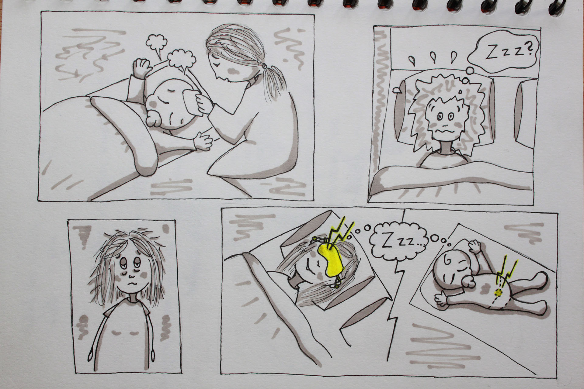
To help you understand how a product or service will function, its benefits and
weaknesses, a storyboard can be useful.
Sketching is used to make design decisions visible within the designer team as
well as for stakeholders and users.
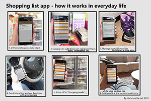
Photograph-based storyboard

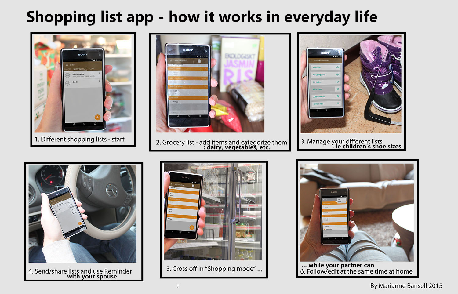
By combining user interface mock-ups and regular photographs you can create
a storyboard which really shows your app in use.
This method makes it possible to the product working in real life before
it even exists.
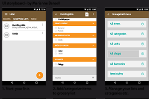
User interface mock-ups

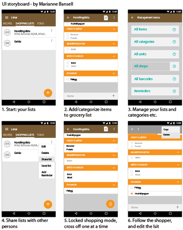
User interface mock-ups are made for different reasons. You can see the design
of your app. But you can also see if its use is logical and user friendly, optgroup
lacking in any way.
These mock-ups are also useful if you want to create a photograph-based storyboard.
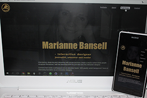
Responsive webdesign: MB website

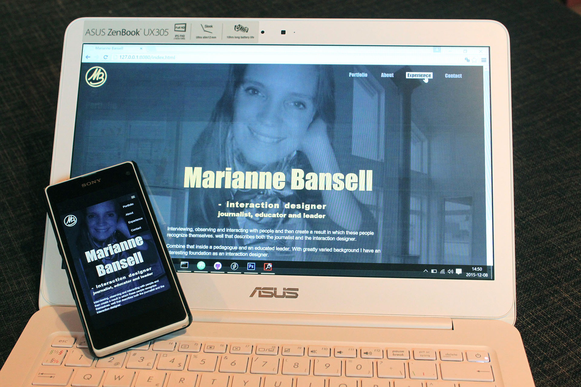
Working on this website regards were made to design principles, graphic design, and
usability.
On the index-page there’s a background-image of me and the house I’ve designed combined
into one picture. I’ve tried to make the picture very subtle, but so you can see my face
– even if you resize your window.
I’ve made a colour-palette in my dark colours, with a little bit of gold.
My portfolio-page is a grid of pictures, if you hover over one it goes dark and you can
read shortly what it’s all about. Then you can click on it and the project opens up on
top of the grid, and you can close the project on the X, or choose Next/Previous.
There are media queries for the site to be responsive, and for the CV a pdf-viewer is used.
Freelancing: Created artist's website

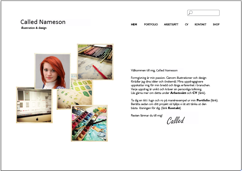
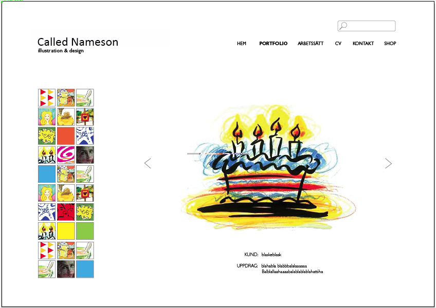
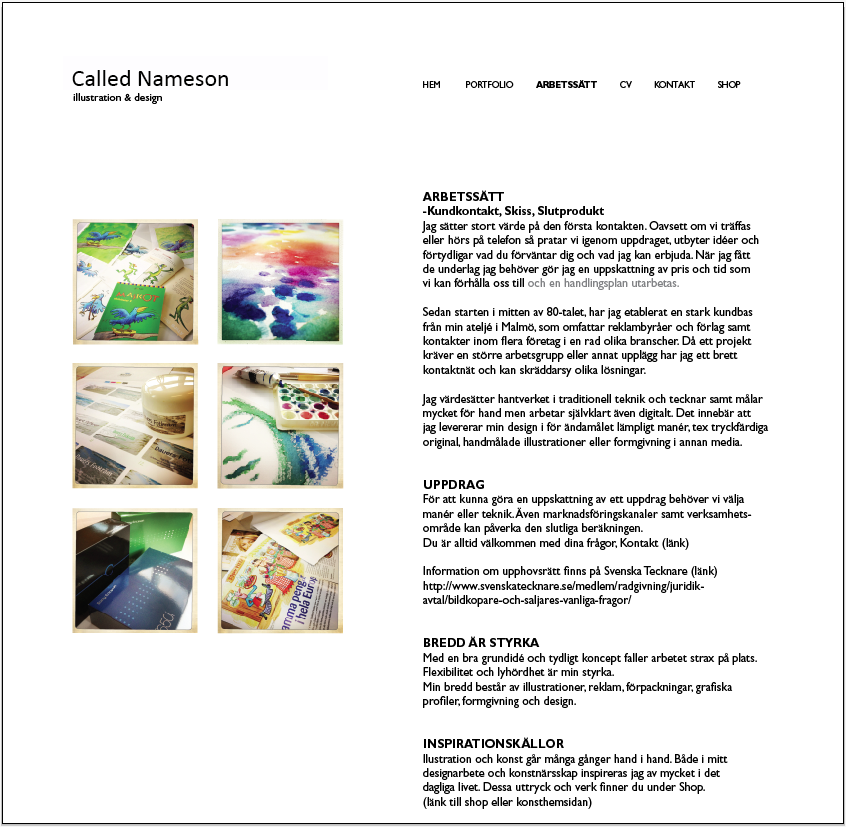
This website was created by me on a freelance basis. An artist needed a site
where she could show her different kinds of work.
The website was created with close contact with the artist. I interviewed
the artist on several occations to get the right design and capture her needs
in a well-designed website.
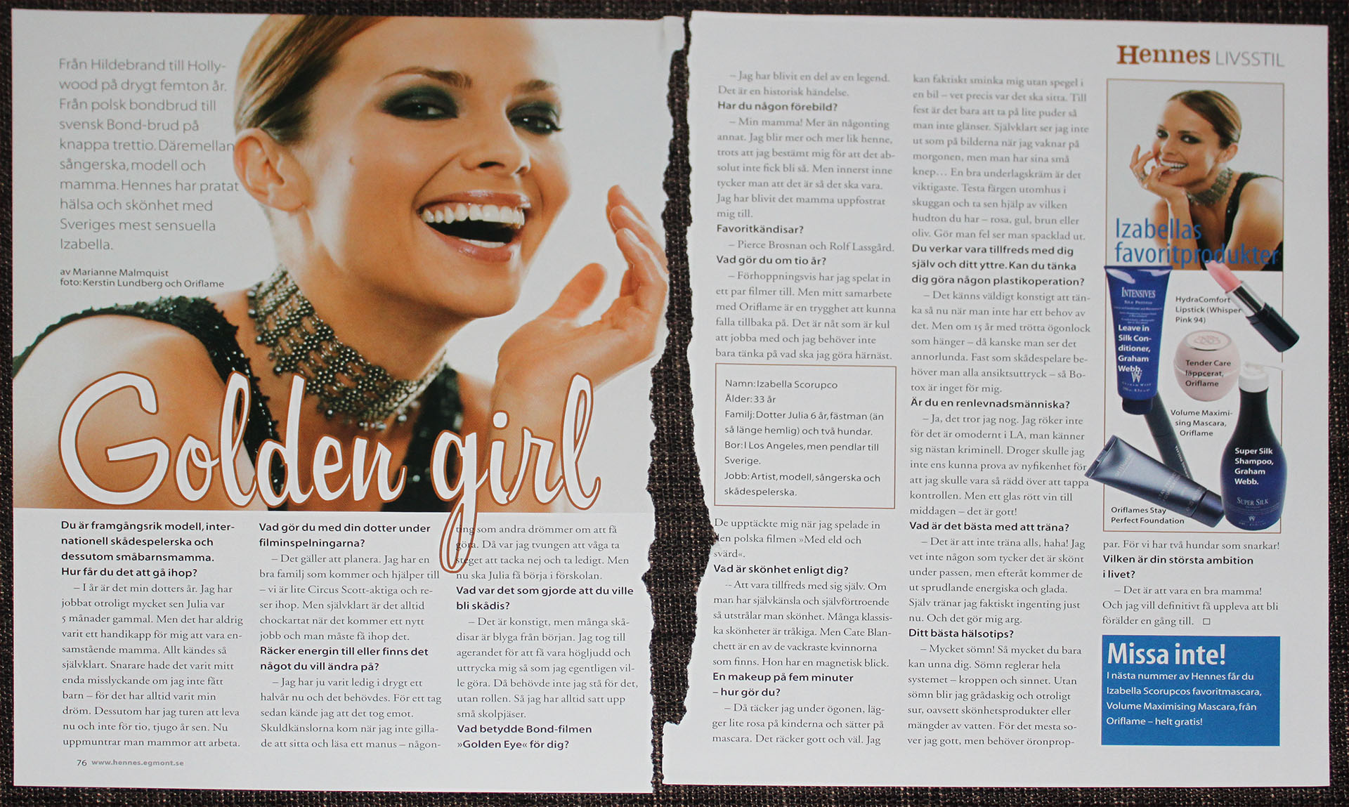
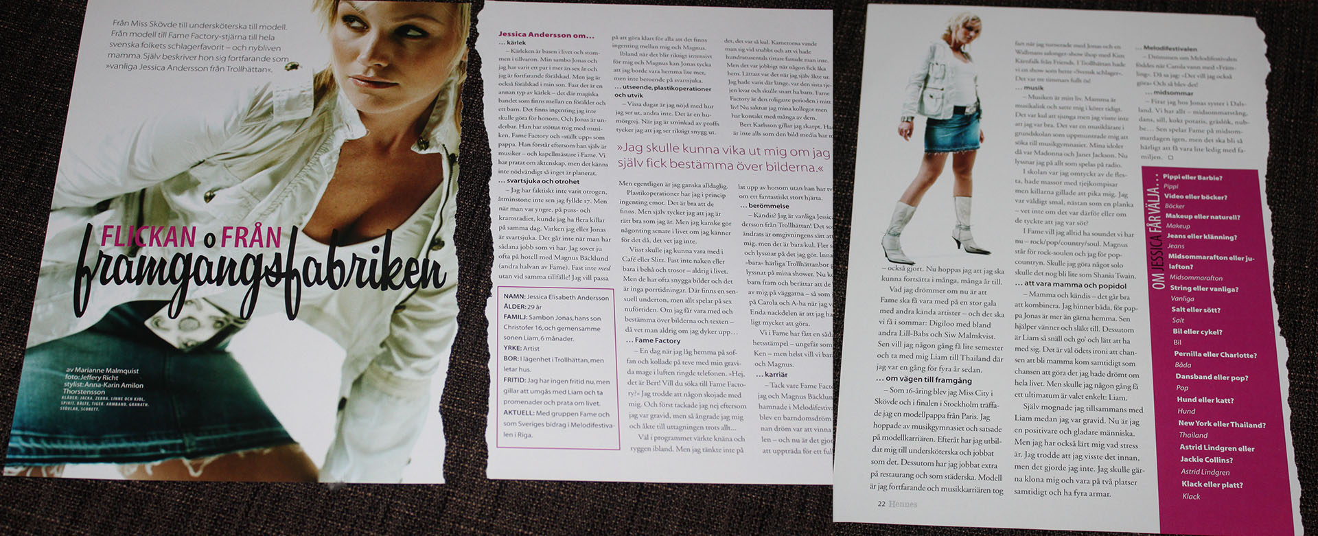
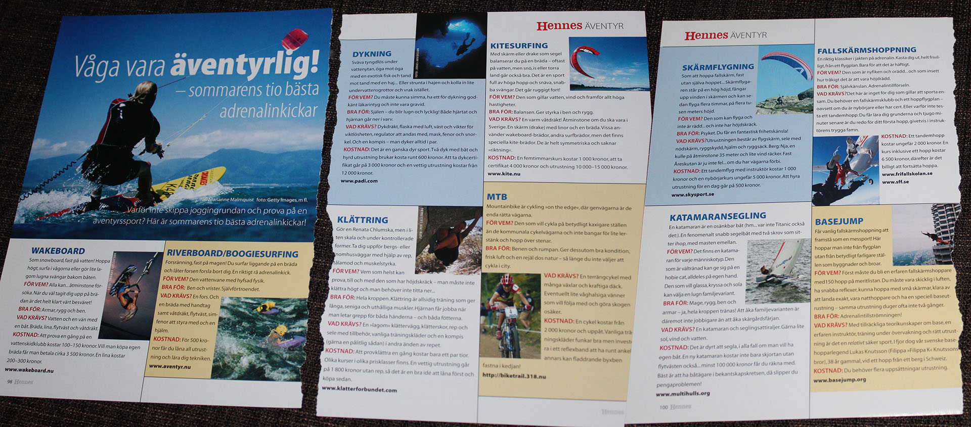
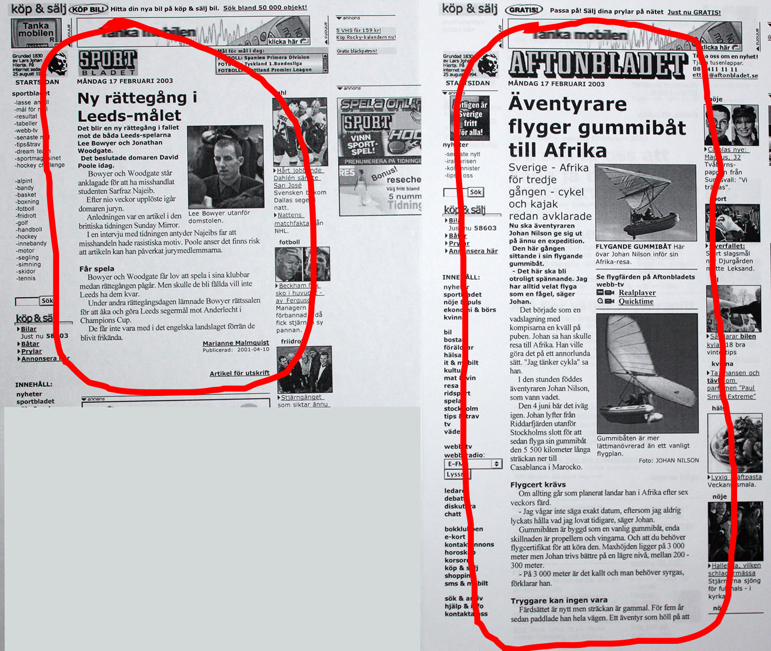
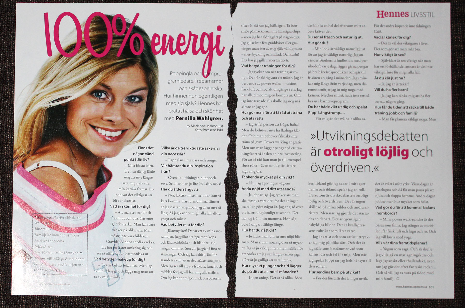
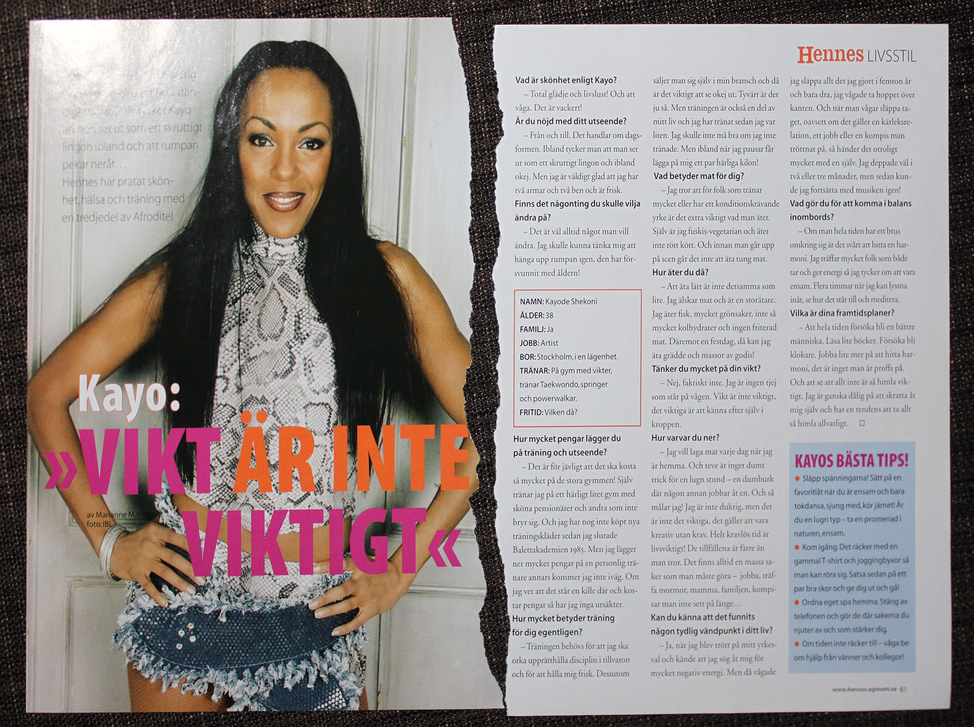
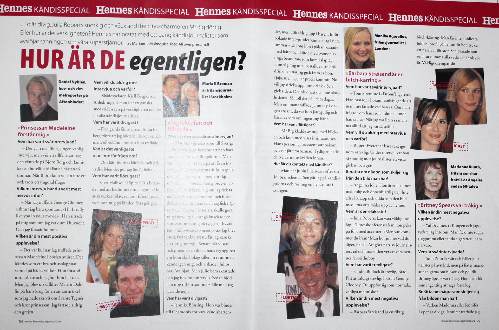
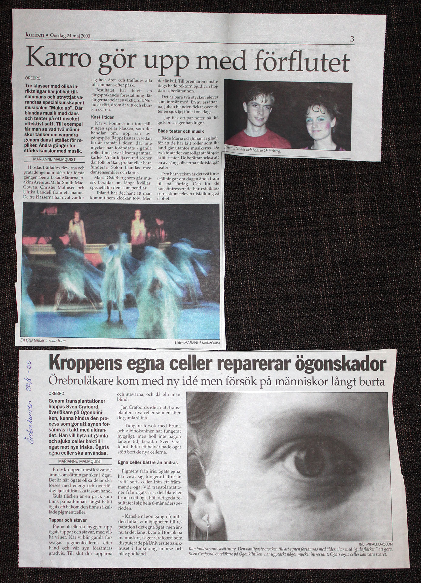
Journalism - news, celebrities, health etc.

